Banking · Mortgages
MOPP.
A bank’s online mortgage pre-approval was losing customers at every step. We redesigned it around three business OKRs, then used what the results told us to change what the product promised: an estimate with a handoff to a mortgage specialist, not a pre-approval.
Role
Consultant Creative Director
Team
10: product design, content, product, data and a 5-developer pod
Timeline
4 months, 6 iterations
The ask
Audit the flow against UX standards and recommend improvements
Results, 3-month average
+36%
Application completion
+8%
Successful pre-approvals
+67%
Leads to mortgage specialists
(01) The goal
Two sides to serve, three OKRs to prove it
What customers want
- Lock in a rate for 130 days
- Know the mortgage they qualify for
- See the lender’s willingness and possible terms
- Have proof of financial capability for the market
What the lender wants
- Acquire a potential customer
- Pre-screen and verify financial status
- Filter applications
- Give customers more time to meet conditions
Frictionless experience
Completed ÷ started applications
Value to lender
Successful pre-approvals ÷ applications
Quality of applications
Final approvals ÷ online pre-approvals
(02) The audit
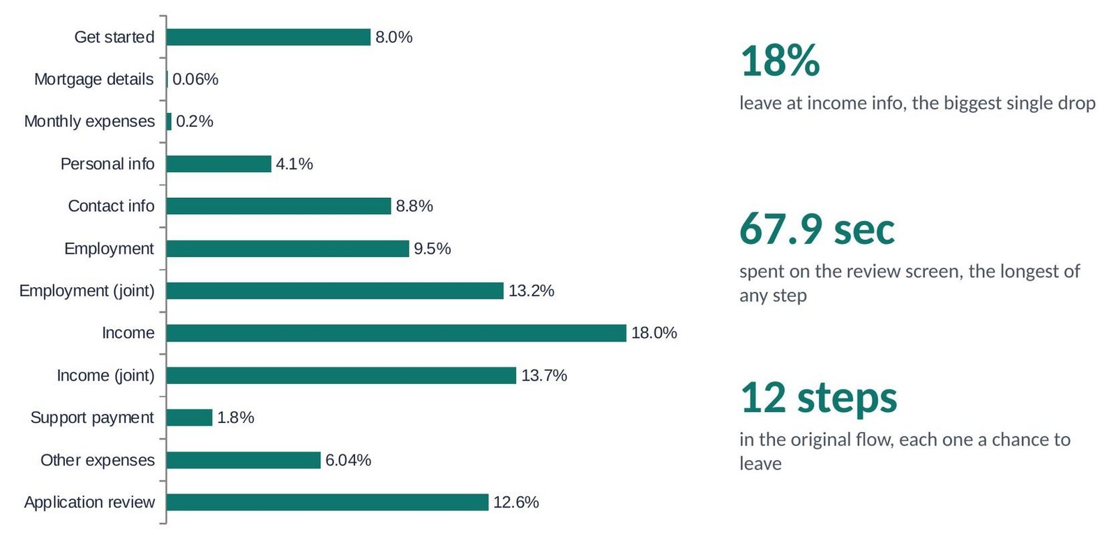
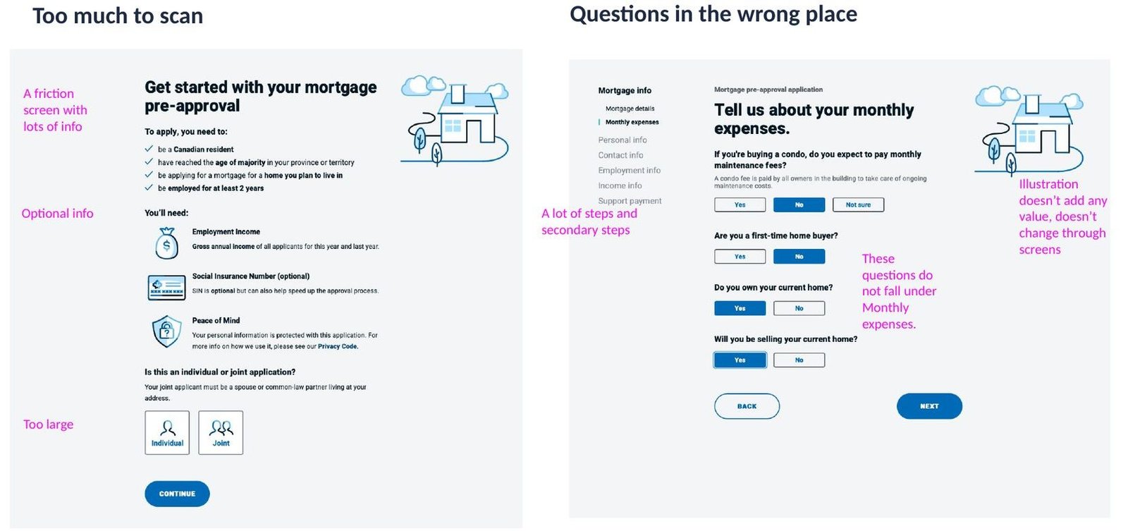
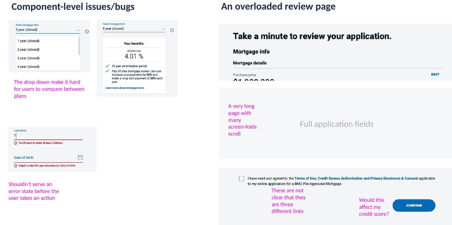
Where the old flow lost people
18%
Leave at income, the biggest single drop
67.9 sec
On the review screen, the longest step
12 steps
Each one a chance to leave
(03) The redesign
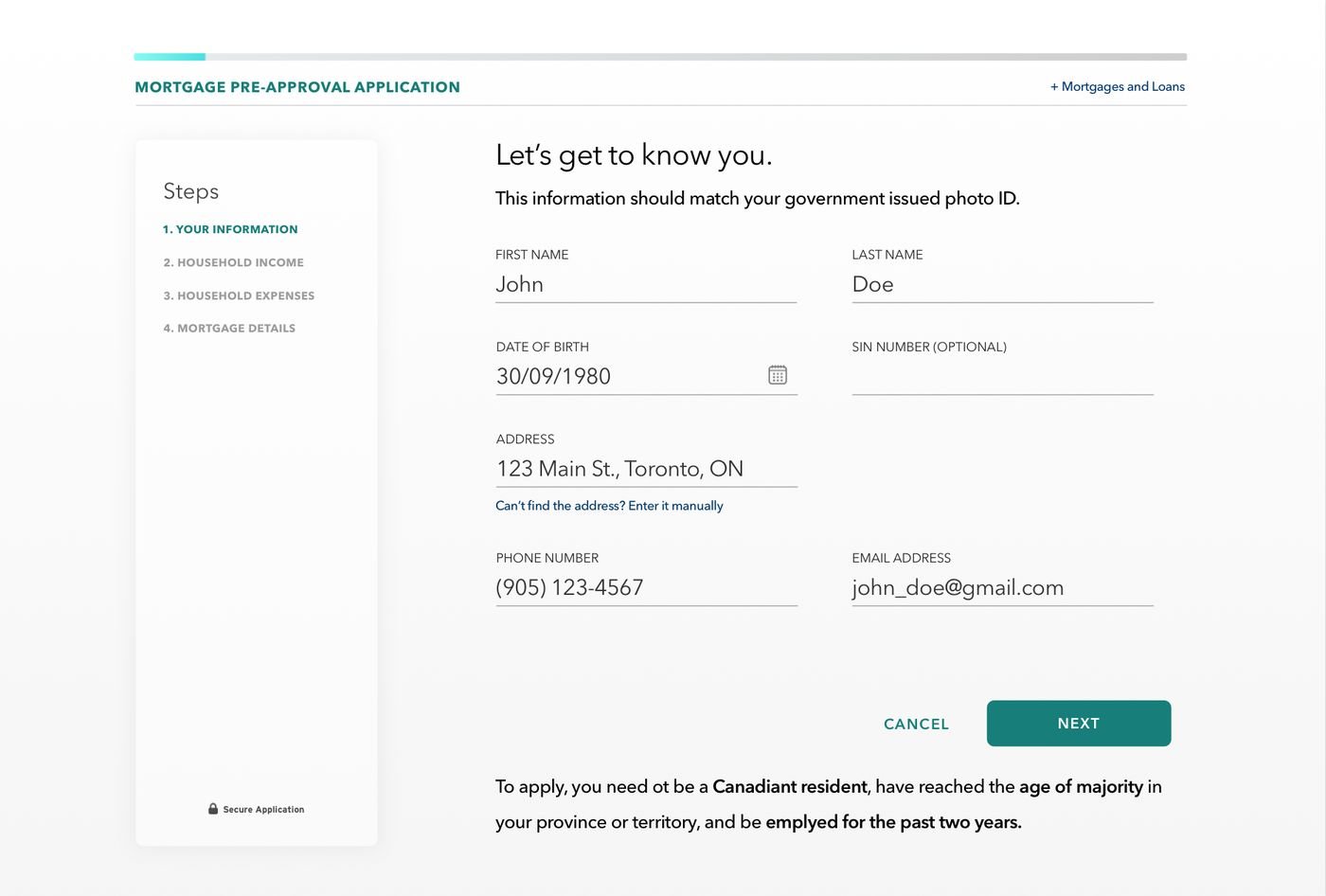
Three principles, four clear steps
Only collect required details
Every field had to earn its place in a pre-approval.
Steps ≠ screens
Show progress in a few meaningful steps, not a long count of screens.
Enough info to decide
Show rates and terms side by side so people can compare and choose.
Step 1
Your information
Step 2
Household income
Step 3
Household liabilities
Step 4
Potential mortgage
(04) Results
Judged by the OKRs, not by the screens
+36%
Frictionless experience
A big improvement, but not enough on its own.
+8%
Value to lender
Alongside a 67% increase in leads to mortgage specialists.
+1.8%
Quality of applications
Didn’t meet expectations. This is the number that changed the plan.
(05) The pivot
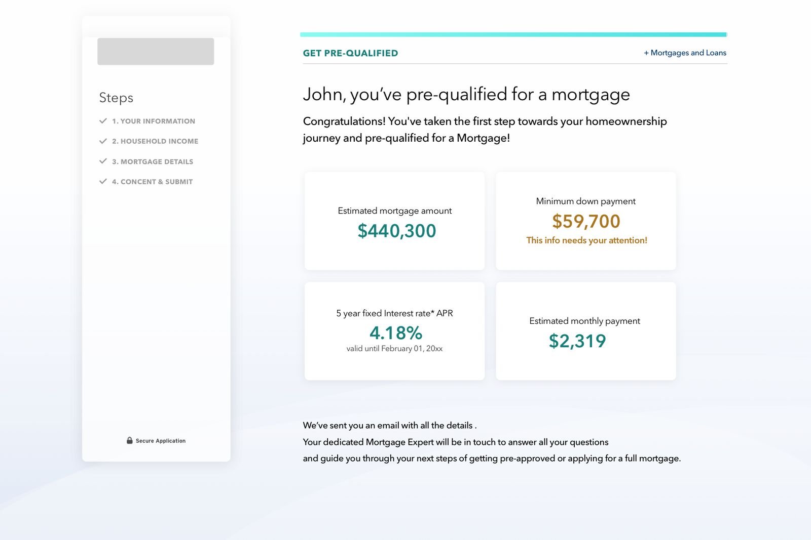
It’s an estimate, not a pre-approval
What we learned
- Underwriters don’t trust information from online applications
- Every detail needs documents to back it up
- A full credit check is still required
- Lender targets and rules change, and so does the customer’s situation before closing
A better interface couldn’t fix a gap between what the product promised and how underwriting works. So we changed the promise: ask for less, give a clear estimate, and hand the customer to a mortgage specialist for the real pre-approval.
(06) What I took from it
Three lessons I still use
Design the whole chain
A better interface can’t solve a mismatch between the product’s promise and the underwriting process.
Promise what the process can deliver
An estimate with a specialist handoff matches how underwriting really works.
Judge design by the business OKRs
Completion moved, but only the final-approval OKR showed whether the design created value for the lender.
Next case study
Project BBID
Rebuilding sign-up and identity for about 120 million monthly users: −67% sign-up churn in two quarters.
Do you like what you see?
Let’s talk.
Clear direction, trusted leadership, and design that moves the business forward.